Main Menu
The Heard Natural Science Museum & Wildlife Sanctuary has been a staple in the Dallas-Fort Worth Metroplex since its opening in 1967. They provide educational programs and conservation projects for young people, families, retirees, and seniors.

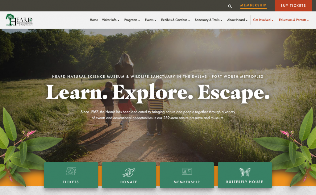
The Membership Coordinator contacted us after realizing that Heard Museum needed to outsource web design after years of continuous development and expansion. Heard’s continual addition of educational programs and resources eventually cluttered navigation and led to broken pages. Free education deliverables, ticketing, memberships, and donations were not easily accessible, decreasing click-through rates and increasing bounce rates. In addition to functional challenges, their website messaging and imagery had become outdated and no longer matched the rich presence true to their identity. Therefore, our goal was to deliver a site that visitors could intuitively access, improving the organization of ticketing, memberships, donations, and payment renewal pages.

Brand Strategy
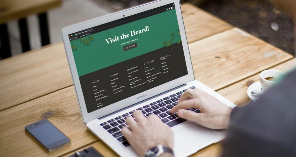
During the early phases of the project, Heard Museum’s goals were oriented towards producing an intuitive, family-friendly, and nature-inspired website. Heard Museum strategized to improve user experience and update visual branding on the new website. Once aesthetic and functional goals were defined by our team, HMG began testing user journeys, restructuring site navigation, updating messaging, and refreshing visual design. After conducting a thorough analysis on how users were utilizing the website and identifying pain points, the site structure was reprioritized. The intent was to make it easier for a user to find primary information while still easily accessing more detailed information such as events, programs, etc.
Design
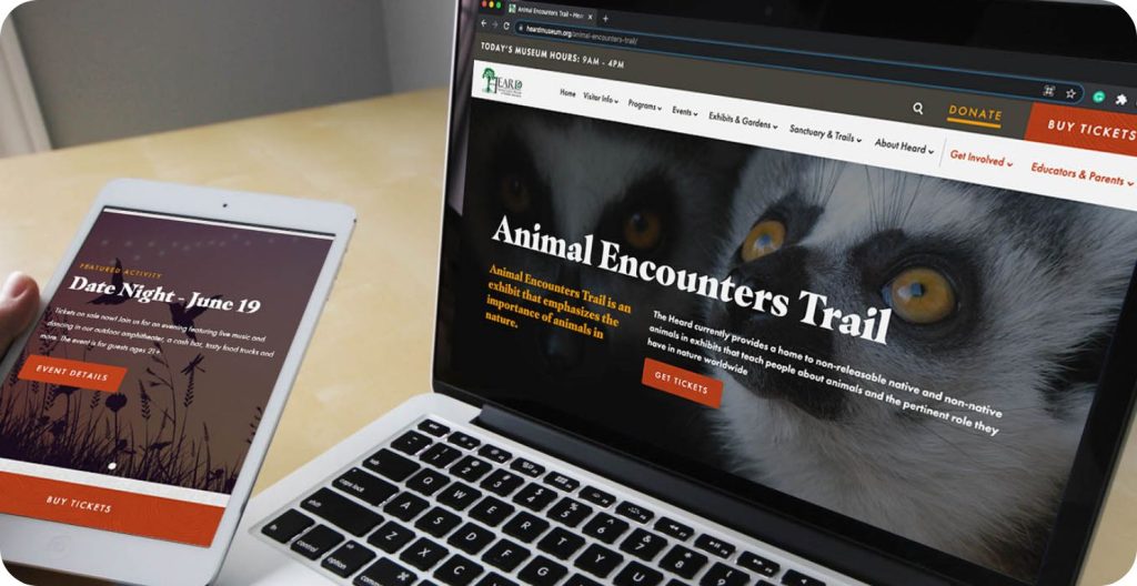
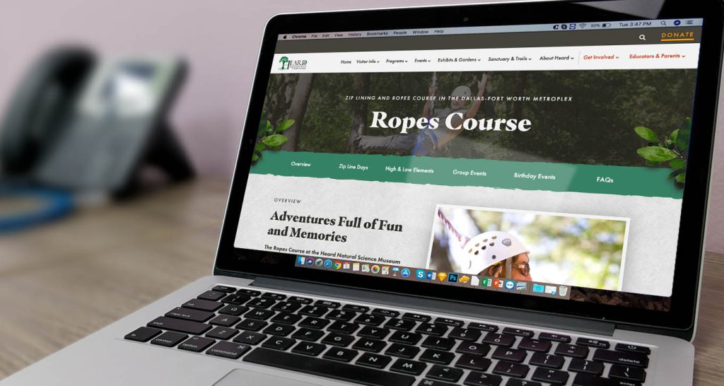
Heard Museum is known for being something of an oasis amid its bustling DFW Metroplex backdrop. With its unmanicured trails, gardens, pond, and wildlife, Heard offers a unique nature experience that’s hard to come by in the surrounding urban area. To emphasize this, we selected a color palette, fonts, and imagery that bridged the physical experience with their digital presence. At the foundation of their color palette is the green featured in their existing logo. We expanded on this with some earth tones that complement the green and provide a natural, warm and welcoming style. Organic elements emphasized the unmanicured experience encountered by visitors of the Heard Museum. Intending to enforce the organic plant feel, we selected typography that featured smooth leaf-like serifs and soft curves. Likewise, imagery, illustrations, and patterns featured plants native to Texas, pairing combined elements to reflect a strong sense of warmth and wilderness. Functionally, a key priority was reorganizing the site layout so users could access the tickets page with one click. The objective of revising site navigation was to reduce overall clicks before the user reaches the desired destination.
Web Development
A request made by the client early on was to maintain their ability to edit the site easily. We used the combination of WordPress as the CMS and Elementor to ensure that any future edits to the website could be made with ease. Additionally, we integrated WuFoo forms on their site since they were already familiar with the service, and had collected various data throughout the years. We also provided customizable templates, making the addition of future pages more straightforward.
Following the publishing of Heard Museum’s website, we continued tracking, collecting, and analyzing performance data from pre-and post-launch. Closely digesting this information provided a solid foundation for our developers and helped us make adjustments and increase website performance later.


We analyzed the site’s performance 90 days after launch and found a substantial improvement in performance! To try to compare apples to apples best, we stacked the new site’s performance against 2019 since 2020 was … well … an interesting year for user behavior. Our biggest takeaway? A major SEO improvement as well as the website’s ability to get user’s to the right place.
Increase in Organic Traffic
Increase in Traffic to Tickets Page
Increase in Traffic to Membership Page