In the new digital age, it has become essential for your business to have an effective website. With 97% of consumers now researching local products and services online, even a company that operates mostly through brick and mortar locations can suffer from not having a strong web presence.
Thanks to the increased availability of website building tools and growth in the web design service industry, creating a website is now more accessible than ever. However, this increase in accessibility has raised the bar for what consumers have come to expect from an online experience.
Thankfully, creating a strong site is not a matter of guesswork. Let’s take a look at the key indicators of an effective website.
CLEAR USER JOURNEY
Your user journey is the series of steps that your visitors take on your site to reach a goal, like making a purchase or signing up for your newsletter. These journeys will be different for each of your personas, but understanding them is essential for ensuring customer success.
First and foremost, a smooth user journey ensures that visitors have an enjoyable and successful experience on your website. By making each step of the journey as seamless as possible, you are better able to guide your visitors towards the action that you want them to take. If users have a hard time finding what they are looking for, they won’t hesitate to go elsewhere.
What Makes A Clear User Journey?
Crafting a clear and effective user journey starts with knowing who you are crafting it for. To really understand the experience that visitors will have when interacting with your site, you need to know how they think and how they respond to certain types of content. Hopefully you’ve already identified detailed personas for your brand, but if you haven’t, check out HMG’s presentation to learn how. These are the foundation of any user journey. A clear user journey makes good use of persona data by:
- Taking into consideration what the user is thinking and feeling at each step
- Crafting content to fit each persona’s unique interests and needs
- Having a specific goal that it is leading the user towards
- Making it easy for the user to find what they are looking for

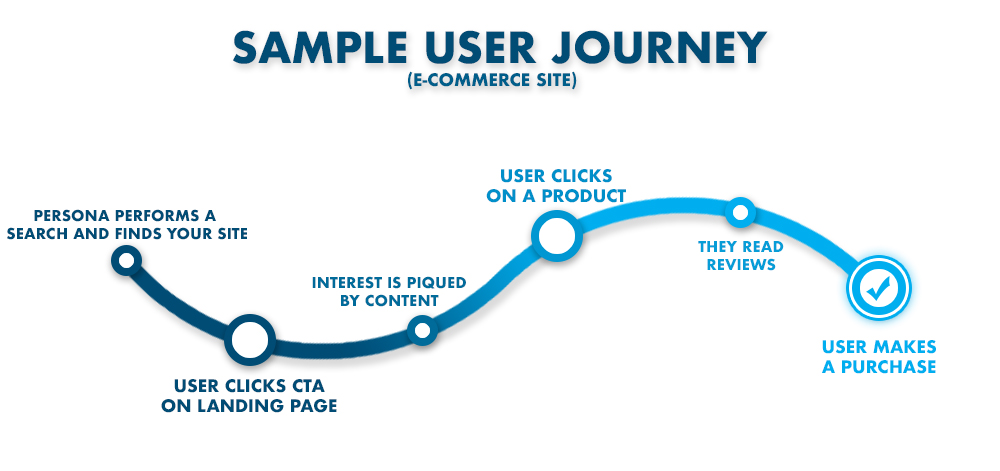
Above is a high-level example of what an ideal user journey might look like on an e-commerce site. While not everyone is aiming to sell a product, every site does have goals that they are leading their customer towards completing. The final step of the journey could be signing up for a service, completing a form or downloading an e-book.
MOBILE RESPONSIVENESS
It should come as no surprise that mobile responsiveness is essential to the success of any website. In 2020, over half of all web traffic comes from mobile devices, and Google even ranks websites based on their mobile versions. As we have covered in a previous article, your mobile site is no longer an extension of the real thing, it is the real thing.
When a website is responsive, its content dynamically adjusts to fit any device that it is viewed on, regardless of screen size or dimensions. This ensures that your site’s navigation is always smooth, and helps to speed up your mobile site.
Key Elements of Mobile Responsiveness
- The same information and content from the desktop site is available on the mobile version
- Buttons are large, readable, and have adequate space around them
- All text is large enough to read without users having to zoom in
- Users don’t have to scroll left or right to see anything
- CTAs stand out clearly and are easy to engage with
- Menus are simple and unobtrusive, such as the hamburger, dropdown, or other collapsible menu options
- Popups don’t cover the landing page’s main content
“Your mobile sight is no longer an extension of the real thing, it is the real thing.”
LOAD SPEED
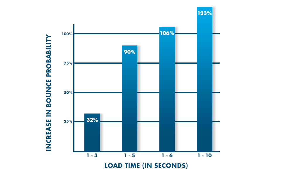
Your website’s load speed is the first thing your visitors will notice. In fact, 53% of people will leave a site that takes more than three seconds to load. So all those great blogs you’ve written and those fancy widgets your developer added? They may never even be seen if your website doesn’t load quick enough.
What Effects My Site’s Speed?
- Images- If your site loads slower than you’d like, your images are usually a great place to start. Large image files are greedy, and consume valuable bandwidth.
- Code- A snappy website is built with clean code. Avoid excessive white space, empty lines, unnecessary comments, and the use of multiple CSS stylesheets.
- Flash- It had a good run, but Flash is dead. Adobe officially announced that it will no longer update and distribute the software after the end of 2020. Flash was always clunky and a security risk anyway, so this is not a terrible thing. However, any remaining Flash content should be rebuilt using modern, widely-supported web technologies like HTML5, animated SVGs or JavaScript.
- Caching- Caching stores certain elements of a website for future visits. With caching enabled, a returning visitor’s browser only has to download a few resources instead of all of them. This makes reloading pages that much quicker.
Google takes speed seriously, and they’ve even created their own PageSpeed Insights Tool to help you measure your website’s load time. After entering in your URL, this tool will analyze your site and provide a speed score along with some information on how it can be improved.

Source: Google/SOASTA Research, 2017
ACCESSIBILITY
One of this year’s internet buzzwords, accessibility refers to websites being fully and equally usable by everyone, including individuals with disabilities. This includes anyone who is blind or deaf, and individuals who navigate with voice, screen readers, refreshable Braille displays, or other assistive technologies. Although the Americans with Disabilities Act (ADA) does not specifically include websites, it is commonly interpreted by U.S. courts to apply to them. And in order for your website to be ADA compliant, it needs to be accessible.
What Features Make a Website Accessible?
- Videos, images and audio have descriptive alt text
- Audio and videos have text transcripts and/or descriptions
- Videos have closed captions
- Consistent headings and labels
- Text has a minimum contrast ratio of 4.5:1
- Text can be enlarged up to 200% without loss of content or functionality
- Site is navigable with a keyboard and includes a visible focus indicator
- There are multiple options for navigation, including a search box, navigation menu and HTML sitemap
- The site’s language is included in the code so it will be recognized by assistive devices
This list is just the foundation for making your site accessible. While there are currently no official regulations for what makes a website ADA compliant, the W3C has put together a comprehensive reference to help make your site as accessible as possible.
SECURITY
The importance of having a secure website cannot be overstated. Hackers have a plethora of ways that they can damage your site and its data, so your site’s security has to be a top priority. Plus, Google takes site security into consideration for SEO ranking and penalizes websites that are poorly secured. Even worse, your website could receive Google’s dreaded “This website is not safe” popup, decreasing your organic traffic by nearly 95%. Let’s avoid that.
What Makes A Secure Website?
- SSL/TLS Certificate– this technology creates an encrypted communication between a website and the browser. This lets visitors know that it is safe to transmit sensitive information, such as credit card info or personal data. A TLS certificate will enable HTTPS for your site, and the little padlock icon will appear in the address bar. Let’s Encrypt issues free SSL/TLS certificates to qualifying sites. Google flags any site that is unencrypted, so this step is a must.
- Passwords- choose strong passwords, and change them regularly. Password123 doesn’t quite cut it.
- Backup your website constantly. If something does go terribly wrong, you can at least be prepared for it.
- Updates- keep all software and plugins up to date. Many updates are created to fix security breaches, so failing to update may open your site up to attacks. More on this next.
Here at HMG, we take an active approach to ensuring the security of every site we develop, including proactive monitoring and daily backups. Click here to learn more about the steps we take for proper web maintenance and security.

WORDPRESS
Although we’re a platform-agnostic agency here at HMG, WordPress is often the best recommendation for our clients and many of their sites are built on it. Similar to plugins, a WordPress site also needs to be updated regularly to remain healthy and secure. Luckily, WordPress makes this process easy by allowing you to install their security and minor updates automatically. Many of these updates are created to fix a security breach, so failing to install them could open your site up to hackers and attacks.
Plugins
As for updates to specific plugins, it’s better for these to be installed manually. It is possible to turn on automatic updates for individual plugins, but this is not recommended, as many updates are prone to having small bugs at first. Thankfully, the developers are usually able to patch these issues within a few days, and then you can safely install the update. In general, waiting seven days is the sweet spot. This allows adequate time for any issues to be fixed, but isn’t so long that you expose yourself to attacks.
While plugins are an essential part of any website, either on WordPress or another CMS, they need to be properly maintained in order to remain safe and effective. Make sure you are only downloading plugins from trusted sites and developers. Not only could bad plugins make your site buggy, but they could even contain viruses or other types of malware.
Backups
Another important aspect of maintaining your website is performing regular backups. By backing up your website, you are creating a safety net for yourself in the case that a plugin causes issues, your site crashes, you get hacked, or any other unfortunate event. There are plenty of plugin options for performing backups, from the very popular (and free) UpdraftPlus to the reliable BackupBuddy.
GOOGLE ANALYTICS
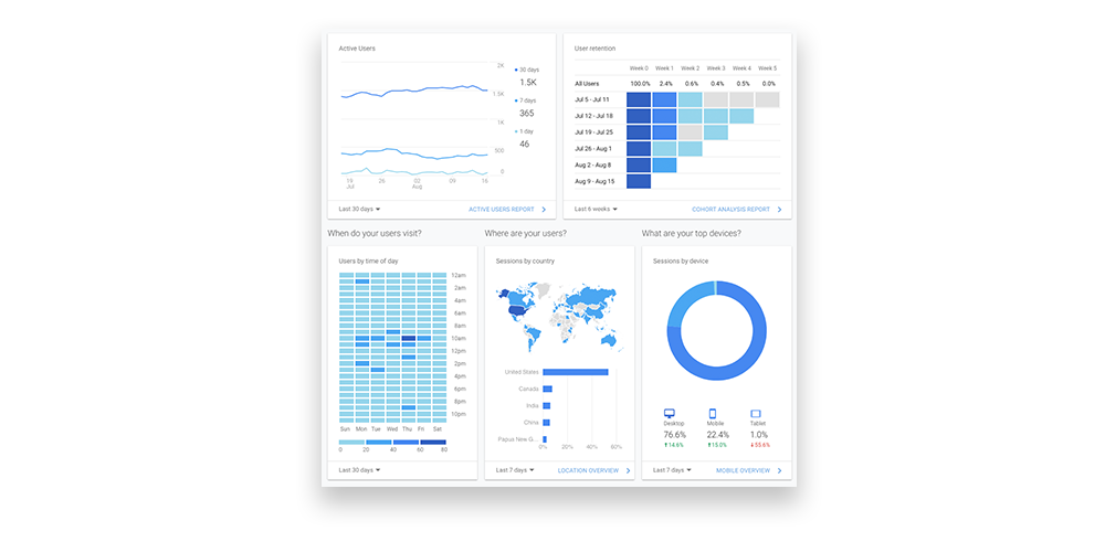
Now that you have made some changes to your site, how do you actually track their impact? With Google Analytics, of course. GA is a great tool that, when properly utilized, can help you gauge the effectiveness of your website and optimize the user journey.

Google Analytics provides a ton of insight into how visitors are interacting with your site and where they are coming from. You should definitely dig into all this info over time, but for now, let’s look at a few key metrics for website effectiveness:
Traffic
As always, finding out who you’re dealing with is a strong first step. In Google Analytics, under the “Source” and “Medium” tabs, you will find information on where your site’s visitors are coming from. These are sources like email, organic search, social media, and the like. You can also find information on your traffic’s geographical location, as well as the devices they are using to access your site.
Do your site’s visitors match up with your buyer personas? If not, then you may be targeting the wrong people. On the other hand, there may be an audience that is interested in your product that you hadn’t considered marketing to. In either case, your analytics can assist you in refining your marketing efforts to target the right audience.
Bounce Rate
Bounce rate is the percentage of visitors who leave your website without ever clicking or taking any action. Occasionally, a high bounce rate is not necessarily a negative thing. Maybe the user got exactly what they wanted from the first page they visited, in which case, congrats! But more often than not, a high bounce rate is a sign that there is an issue, such as:
- Load Time- This should be a no-brainer. For every extra second it takes for your site to load you will be losing visitors.
- Content- Visitors aren’t finding the content they expected. This could be due to a misleading title tag and/or meta description.
- Popups- Not all popups are bad, but it is easy for them to come across as spammy and annoying when used improperly. If your website does utilize popups, make sure they fit with your UX and provide visitors with some real value. Also, make sure your popups are easy to close for users who are uninterested in the offer.
- Design- As we mentioned earlier, the design of your website can make or break its effectiveness. If visitors land on your site and have a hard time finding what they want, they will just go somewhere else.
Conversion Rate
Any completed activity on your site can be considered a conversion, such as a purchase or completed sign-up for your email list. Similar to bounce rate, your conversion rate is the ratio of visitors who are completing your desired goals. If your conversion rate is low, dig into your Analytics to find what pages your visitors are bouncing from and make some improvements.
Site Search
If your website utilizes a Search feature, Analytics can help you leverage it to gain even further insight into what your visitors want. Under the Behavior tab, select Site Search and then Search Terms. Here, you will see all the terms that your visitors have entered into your Search box. If there are searches for terms that do correspond to pages and content on your site, then you may need to make those pages and items easier to find. However, if there are a lot of inquiries for something that is not currently on your site, that could be an opportunity to create some new content and meet that demand.
Google Analytics has had a place in the tool belt of any web developer or marketer since 2005, and thanks to the new layout and capabilities included in Google Analytics 4, it is more powerful than ever. It may seem like a hassle to get set up, but is well worth the effort. Check out our Website Launch Guide for help on setting up your Google Analytics properly. This is certainly a tool that you do not want to be operating your website without.
CONCLUSION
The internet has become an incredibly crowded and busy place, but operating an effective website is probably easier today than it has ever been. That being said, it has also become more necessary than ever. By taking advantage of the technology and endless information that is available, even the smallest businesses can even the digital playing field.
Keep in mind, an effective website is just part of the battle. Everything from your logo to your social media presence needs to work together to build a brand that your audience falls in love with.
If you need a hand with any aspect of your brand, send us a message. We would love to be part of your journey.