Is Your Business Card “Cardworthy”?

Years ago, a former marketing professor from the Gonzaga School of Business had given our class a few words of wisdom as we approached graduation weekend and were about to hit the pavement looking for jobs.  He said, “Dress sharp, get yourself a nice pair of dress shoes, polish up your resume and invest a little in a quality set of business cards.  It will set you apart from the competition.”  If you think about it, everything he said has to do with the first impression we’d make as first time job hunters.

Recently, I reflected back on Suppliers Compared and realized that his advice still holds true, except that my resume has been replaced with an informational brochure.  Yet it baffles me that as simple and straight forward as this advice might seem, I come across so many, yes,  “crappy” business cards.  Weeks or even months later as I’m thumbing through the pile of cards I’ve collected, the first thing I associate with the quality of the company, is the quality of their business card.  Mainly because I don’t remember much and this is the only tangible thing I have in my possession representing them. If a company isn’t going to spend the time to put some thought into designing their own business card, what does that say about the quality of job they will do for me?   Let’s just say there are some cards, unfortunately, that get thrown in the trash.

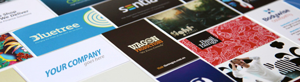
So for those running low on business cards and are contemplating another batch of the same old card, I recommend going to DX Print Group. If you are unsure if you should change your card, my alter ego, Rob Cardworthy has put together a list of things that may indicate “You might need a redesign.”

  • If your card looks like it may have been printed on a “black and white” printer kopen, then you might need a redesign.
  • If your card has corrugated edges and looks like it was printed on coupon paper, then you might need a redesign.
  • If your card looks like a rainbow collage and often gets the response, “Oh wow, that’s pretty!”, then you might need a redesign.
  • If your card is designed in a way that looking for your contact information is like playing a game of “Where’s Waldo?”, then you might need a redesign.
  • If your “business” card really doesn’t communicate WHAT your “business” is, then you might need a redesign.
  • If your card is……ummm…..B O R I N G, you might need a redesign.
  • If your card is thin enough to double as dental floss (only in a pinch though), then you might need a redesign.
  • If your card should have come with a magnifying glass, but didn’t, then you might need a redesign.
  • If your card uses more fonts than the number of friends you can squeeze into a Car 2 Go, then you might need a redesign.
  • If you are using one of those free services that states, ” Printed for free at imcheap.com”, then you might need a redesign.

Here’s the bottom line; invest a little bit and get help from Las Vegas printing companies, among others, to design a business card that will leave an impression.  It should be simple, creative, informative and of high quality.  You want to be remembered, and at the end of the day, it’s your card that’s going home with the business prospect, not you.

If your business card suffers from one or more of the symptoms above we can help.  Our design/ printing services are second to none so please give me a call, Rob Cardworthy (512) 994-4429 or email me at rob [at] hmgcreative.com

Writing So People Will Read

Is your writing full of jargon and technical-ese? Most writers, myself included, have been guilty of boring readers to death with a hard-to-follow style, just for the sake of sounding intelligent. Unfortunately, in the lightening-paced realm of the blogosphere, readers have become less and less forgiving of such a mistake. But the good news is that you can grab reader attention and communicate your message in a memorable way by paying attention to the new rules of writing for an online audience.

Rule #1: Be a real person.

Share experiences, talk in first person, and let readers see not only your strengths but also your mistakes—especially if you learned something from them that’s worth sharing. Think through every post and determine your message and main points before you just dash off something for the sake of having new content.

Continue…

Making Your Press Release Newsworthy

Remember the old movie “His Girl Friday”? Cary Grant and Rosalind Russell deliver a stellar depiction of life in the newsroom: hectic, loud, frantic, and intensely competitive. Now, imagine dropping a press release on the desk of brash newspaper editor Walter Burns and standing back smugly waiting for him to drop everything as he gobbles up the breaking news about your company’s new acquisition. Likely? Not very. And in today’s newsrooms, the internet has brought about a whole new level of competitive demand when it comes to deciding what’s newsworthy and what isn’t.

The good news is that you can take some tips from the email marketing world in order to grab that reporter’s attention and convince him that your press release is more newsworthy than the eighty-seven others he received that day.

Grab Attention Right From the Get-Go

Just as the subject line of an email will make or break the success of any given message, the headline you use for your press release will either shout “Newsworthy!” or “Boring!” If you’re pitching an item about your company’s growth, phrase it like this: “20% of new car shoppers are making decisions to go green with their vehicle choices.” Not like this: “XYZ car dealership experienced growth in the first quarter.”

Pitch It, Don’t Plop It

Email subscribers don’t waste their time on stuff that bores them, and neither will a news reporter. Don’t just plop your unadorned press release in the reporter’s inbox. He has no reason to spend ten minutes of his day reading your information unless you convince him that it would make a good story. So pitch it. Find an angle (local interest, new survey results, or connection to a current story) and include your most enticing tidbits of information.

Keep It Brief

Remember Walter Burns? Assume that your news reporter is every bit as harried and distractible as good ol’ Walter, so keep your communication with him short. Two or three paragraphs provide plenty of space to get the vital information across, with links to the actual press release for more information.

Make it Personal

Take the time to personalize each press release email you send with the news agency and the reporter’s name. Also, let him know why you’re contacting him in particular: he’s covered your business in the past, he typically covers items on this topic, or you think you have a great local interest angle.

Network

Last but not least, spend at least a little time building a reliable media list for press release distribution. Just like your email subscriber list needs to be maintained and purged every so often for best results, so your media list should be kept succinct and active in order to get the greatest return for your efforts.

Gone Viral: Learning From Dollar Shave Club

Six months ago, if you had mentioned Dollar Shave Club to a room of people, you would have gotten all blank stares (even though the company has been around since June of last year). Today, there are over 4.5 million people who would nod their heads and smile. 4.5 million YouTube views. In just a few weeks. How did they do it?

A viral video incorporates strong planning, careful execution, and a little bit of luck. Fortunately for those of us who have never won the lottery, the strong planning and careful execution part carries a little more weight than the luck part. Can you design a video and guarantee that it will go viral? Maybe not, but by incorporating these lessons from Dollar Shave Club, you can at least ensure that it earns the right to be seen and shared.

Don’t Take Yourself Too Seriously

Humor is something Dollar Shave Club does really well. Seriously. There’s hardly a straight line in the entire video. But they’re not just cracking jokes either. Some of the humor is obvious and some is a little more under the radar, but all of it works together to communicate the vital information you need to know about the company. And it leaves you with that “You’ve gotta see this!” feeling.

Create a Unified Approach

Take a long look at your existing website and craft your video so that it supports your current marketing strategy. When you visit the Dollar Shave Club site, every element hangs together and sends the same vibes you received in the video. Your website visitors shouldn’t wonder whether you’re the same company as the one that produced the video they loved.

Put the Most Important Stuff First

In the first ten seconds, we know what Dollar Shave Club does, how much it costs, and what the quality of the product is. We get our questions answered: How can they afford it and are the razors any good? ( personally I enjoy the best straight razor from my barber and I don’t think that is going to change) If we decide to stop viewing (which we won’t, because their fabulous style holds our attention) we still have everything we need to know to pique our interest and entice us over to the website.

Put a Face On Your Company

Even if you don’t have the marketing background and camera-ease that Dollar Shave Club’s founder, Mike Dubin does, it still helps viewers connect with your company when you put a face behind the name. Make the story human and people will relate to it. Certainly not everyone wants that fresh clean shaved look. In the same theme you can do like http://beardcareshop.com/philips-Norelco-beard-trimmer-series-7200/ and make beard trimming and care sexy and attainable. Or any idea you may have can go viral, you simply have to work hard.

Creating videos people love begins with understanding how to communicate a message they can relate to and want to share. After that, who knows? You just might win the lottery.

Does Your Website Need A Face-lift?

Stop.  Step back and take a look at your business, not from your point of view, but from the eyes of the consumer.  We all get wrapped up in the day-to-day operations of our business and it’s easy to overlook our appearance from the outside.  With a wealth of information at our fingertips, the first impression of a company is most often derived from its website as a person searches for a particular product or service.  As we know, first impressions are critical.  So take a moment to pull up your website and ask yourself the following questions (keep your customer in mind when doing so):  Can you find your website in a Google search for your product or service?  Is the site visually appealing?  Is the content up to date?  Can you find the information you are looking for and is it easy to navigate?  Does the overall design and layout look modern?  Compared to other sites for competing companies, would your online storefront win the business?

If your answer to any of the above questions is “no”, then perhaps it’s time to rethink your online strategy and consider a website redesign.  An out of date website can give an impression that the core of your business is outdated as well.  If you walked into a dental clinic sporting wood panel walls, orange shag carpet and an office manager on a rotary phone, would you feel comfortable asking for a root canal?  Ok, so nobody in his or her right mind would ever ask for a root canal!  My point is that this could be the best dentist around, but you would never know based on the first impression from walking into the office.  Take a moment and ask yourself this:  How do you want your business to be perceived and does your website give off this perception?

Aesthetic appeal is important and pertains to the artistic design and layout of your website.  Overall, this will have the most impact on the first impression of your business.  Studies have shown that little things such as a color scheme or font choice can have a psychological impact on one’s perception.  The layout for graphic elements and information is also important and should flow in a way that coincides with the natural tendencies our eyes have in scanning a page.  Believe it or not, there are hot spots where eyes tend to gravitate on websites and this needs to be taken into consideration. More information on eye movement patterns as it relates to web design can be found here.

Functionality and user experience of a site is also extremely important.  How many times have you searched for information on a particular site, gave up and moved on?  Information needs to be logically organized so the average person can easily navigate in its search.  Keep it simple and remember that often times, less is more.   Too many pages, especially if not properly organized, can confuse and frustrate people to the point that they continue their search elsewhere.

Speaking of searching, if people can’t find your site when searching for your product or service, you’re missing out on potential new business.  Designing a site with Search Engine Optimization (SEO) in mind and having a strategy in doing so is crucial.  Social media integration, blogging and updating your site on a regular basis with current information will improve a site’s SEO, thus making it easier to find during a search.  In the SEO world, remember that content is king.  Also, being able to measure traffic and results is a must; if Google Analytics hasn’t been integrated, it needs to be.

Now that you’ve had a chance to think about a few things concerning your company’s website, ask yourself one more question:  If someone is searching online for your product or service, who’s going to get the call; you or the competition?  If it’s not you, then it’s time for an upgrade.

Give us a call today and ask about our special for May!  For more information contact, Rob Ridgeway, at 512-994-4429 or [email protected]

FACES+ Email Campaign

Special events are a great reason to send your clients an email campaign. Below is a recent campaign we put together for FACES+, a comprehensive plastic surgery, laser and skin care center. They offer aesthetic surgical and non-surgical treatments such as face lift, rhinoplasty, breast augmentation, Fraxel laser facial rejuvenation, dermal fillers, Botox and much more.

Visit Website

QR Codes, So Hot Right Now

You see them everywhere: on business entrances, restaurant menus, movie posters, brochures, direct mail pieces, the list goes on. Although we have heavily utilized these quick response barcodes for over two years in the marketing and tech world, as an industry we have yet to perfect the use of QR Codes (and in many instances failed miserably at understanding their effective placement).

Continue…

We’re looking for Interns (Austin, Tx)

Attention college students:

We are looking for motivated individuals that want to gain experience in the creative services industry, from website/ graphic design to email marketing. This internship is not paid but you’ll gain extensive and valuable experience in all areas of digital marketing. Your major doesn’t necessary have to be associated with digital media but experience with the Adobe Creative Suite is necessary.

If you’re interested please contact our Creative Director, Johnny Jeffers, ([email protected]) for more details.

Thank you for reading.

Real Life Austin – Postcard

In preparation for their upcoming move to a larger location, Real Life Austin hired us to design, print and mail-out 20,000+ post cards to south Austin residence. Join Real Life Austin for their Grand Opening this Sunday (January 29, 2012) at Gorzycki Middle School (7412 West Slaughter Lane, Austin, Texas 78749), service times are 9:00am & 10:30am.